
Demographics of the Nigerian household
What is the age distribution in typical Nigerian households? Are there gender ratio differences across age groups in the country? These are questions I try to answer in this article by presenting visual charts based on the data collected from the most rec


The National Bureau of Statistics in Nigeria in collaboration with the World Bank have been running a series of surveys to better understand the Nigerian household and to provide much needed data when making policies. The following charts are an attempt to provide a visual digest of demographic data from the most recent General Household Survey - Panel that took place between 2018-2019.
There is an official report of the survey published here. It's a table heavy report and does not afford an easy digest of the underlying data. The following are some of the charts I generated from the data. These were built on observablehq. The goals of these charts are as follows:
Get an overview of the age distribution of individuals in the households that were surveyed with any insights on differences in urban or rural sectors.
Get an overview of gender distribution for age-groups of the individuals and see if there are any differences for different sectors, geographical regions or states.
Age Distribution

The distribution of ages shows that 75% of the population are under 35 years old. There is also an interesting artefact in the data showing there are more frequencies of ages divisible by 5, i.e., 20, 25, 30, 35 etc. The national median age is 18 and mean is 24. There seems to be a slight difference between rural and urban areas, with a median age of 17 and 19 respectively and a mean of 24 and 25. This is on par with the Wikipedia entry for Nigeria on the list of countries by median age.
Age distribution by sector and gender
The survey sampled households from all states in Nigeria from both rural and urban sectors. With the exception of population size, the chart below shows very similar trends for both sectors - a population skewed to the right. Some notable things are that there are more men under 20 years old in rural areas and more women than men in their thirties and forties.
The shape of the distribution shows a very similar trend for the rural and urban sectors. In general most of the individuals in the study were young and less than 20 years old.

The ratio of male to female across states
The distribution above shows differences in genders across age groups and sector. In order to see if there are any notable differences between different states I decided to create a different chart that visualises the ratio between male and female for the different age groups for every state. By using a ratio derived from a variable with two possible values, it is possible to visually represent the proportion of male to female in each age group over a continuum across different ages. So instead of using two separate lines (one for each gender), I draw a single line whose y value varies between 0 - 100. When the line goes below the 50 mark it designates having more women for that age and when it goes above the 50 mark it designates having more men. In order to get a sense of how the state compares to the country as a whole, the black dashed curve shows the ratio at the national level. For a bit of context, I plotted a histogram above the chart to give the reader information about the number of individuals that are in each age group. Clearly the number of samples contributing to the ratios decline significantly for the older age groups.
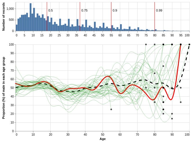
Below is the trend for each zone. Aggregating by zone allows a higher level picture to see typical variations from the national trends. Here we see the North West zone of Nigeria has more older men (between fifty and early eighties). The South East zone typically has more women across age groups above 20.

It is not surprising to see difference across states for gender ratio in different ages. Nigeria is a very large and diverse country with very different cultural practices and norms across different geographic regions. If the data were representative of the region, the gender ratio charts should signal that the states that trend significantly above or below the national trend should be explored in more detail. Looking through these charts should inspire you to ask more questions about how we support people of different gender and ages across different parts in the country.
In a future post, I'll be looking at changes in households over the years that the survey was carried out. If you enjoyed these visualisations and you are interested in drilling down into the data a bit more, there is a live interactive notebook here. Do reach out to me if you have any questions about this data or the visualisations.
Acknowledgements
These visualisations are driven by data collected by the Nigeria National Bureau of Statistics. General Household Survey, Panel (GHS-Panel) 2018-2019. Dataset downloaded from www.microdata.worldbank.org on June 9 2020.
Special thanks to Jeremiah Iyamabo and Michael Braimah for helping to refine this article.